Tuesday 13 December 2011

Evaluation

So for this project I had to create an insert for a wall paper magazine. The topic I decided to do was Beatboxing as beatboxing is one of my main hobbies. So the stages I went through to get to this finished piece were a very good journey. At first I was contemplating on the fact is beatboxing a good way to show 15 minutes of fame but then I thought YOUTUBE. As I already had a youtube channel containing many videos of myself beatboxing I decided how about I make a beatbox tutorial as I think beatboxing is a very interesting thing to know about as it isn’t very common and not many people are able to do this it is sort of extraordinary for people to listen to those who have gained this talent. I had a lot of fun doing this project making these videos was the best part even though I can beatbox I still took me many takes to get the video right and clear for people to understand what I was saying. I have learnt a lot more now in photoshop than I did before I managed to make a front cover and was very pleased of the outcome then I made my poster/beatbox tutorial insert for the magazine. So this project I have managed to do in one constant flow and figuring out that using blogger makes things a lot easier to present the work I have done. Learning from my mistakes from my last project I was able to talk about how I felt about the work and the research I did instead of describing something that was already there my confidence on showing people the way I think about particular things has increased massively over this project. I find my time management has improved a lot as I have kept on point and on task with the amount of time I had to do this project kept things in order. Over all for this project I am pleased with the outcomes and I also am pleased with the comments I had from people about the tutorials and it also has gave me confidence in the near future to make more tutorials to help people and spread beatboxing across to people. I have learnt throughout this project now that people see beatboxing to be another language and I now know more in depth of the whole history of beatboxing and learnt a lot throughout and this has been a good journey and I really have enjoyed doing this project and creating the things I have done and become a lot more open minded about how I think of things.
To conclude I had fun with this project and it has made me think of things in a whole different prospective and the outcomes came out just how I imagined.

Monday 12 December 2011

This is my competition video i decided to make instead of trying to write it all down on paper i decided to do it this way as i find youtube a prime example of 15 minutes of fame and the reason i think this is the fact that people all over can get a video on the internet youtube being the worlds most common website and have others around the world viewing giving that person a small idea of what fame is like by having amount of views like comments etc so the big part in capitals underneath is the description i had written for people to understand what i am doing and how to do it. Hope people do take part and hope you all have fun this is the final video towards my 15 minute of fame project.


HELLO ALL THIS IS MY COMPETITION I'M MAKING FOR THE PEOPLE AT NORTON COLLEGE DOING GRAPHIC DESIGN SO BASICALLY I WANT YOU TO OFF WATCHED MY TUTORIAL IF NOT GO WATCH THEM!!!! THEN WHAT I WANT YOU TO DO IS UPLOAD YOUR OWN BEATBOX FREESTYLE USING THE USE OF MY TUTORIALS THEN UPLOAD YOUR OWN FREESTYLE VIDEO TO YOUTUBE VERY EASY MAKE AN ACCOUNT IF NOT GOT ONE CLICK UPLOAD THEN UPLOAD VIDEO FIND THE VIDEO WHERE EVER YOU SAVED IT ON YOUR COMPUTER THEN LEAVE IT TO UPLOAD YOU CAN ADD A TITLE AND A DESCRIPTION OF THE VIDEO IF YOU DON'T WANT ANYONE BESIDES ME TO SEE THE VIDEO THEN SCORLL DOWN AND YOU WILL SEE THREE CIRCLES WHICH SAY PUBLIC UNLISTED AND PRIVATE GO ON UNLISTED THIS MEANS PEOPLE CAN ONLY VIEW THE VIDEO WHO HAS THE LINK GOOD LUCK 

THE FINAL DESIGN

This is my final design for my pull out i have made a few alterations such as an introduction to beatboxing i found that in my view if something is to be published in a magazine it has to be already known of so doesn't need much of an explanation. I also said i was going to write a guide and a competition piece saying how i am running a competition and a guide for people how to upload there videos and send them to me. So instead of having it written all on paper i made a another video explaining on what i would like to see from people and explained how to accomplish to do so. I also have written in the description box of the video on how to do it as well as back up in case no body was able to follow what i was saying in the video. After discussing ways of laying it out so example having the images titled i found personally not suitable for this type of topic as it is key that people are able to see the images in a line of sequences so it is easier to follow then having to look around the page and following and obscured pattern i would of decided to make. I created this whole piece on photo shop and the image are off my actual beatbox tutorial videos. Me personally i am pleased with this out come everything is clear to read and it is easy to navigate around the page and i like the colour scheme it blends well with the text and the use of bright colours gives it that more eye catching effect.

Wednesday 7 December 2011

This is the final part of the beatbox tutorial in this video this is me demonstrating on how to put the 3 beats i have already shown in to one complete rhythm. Demonstrating to you different tempos of doing this and also looping the same beats over and over hope it helps enjoy. That concludes the beatbox basic tutorial thanks for watching :)
This is the 3rd and final lesson of the beatbox tutorial the outward k snare this one is a bit tricky compared to the other to but i have tried to explain it as simple as i can and i hope it can help you get this beat down.
This is the 2nd part where i teach how to do the HI-HAT a very simple and basic thing for people to learn.
This is my first part of the tutorial that i have made for the project and here i am teaching the bass kick which is a good start for people who want to beatbox to learn.
So this is the final outcome of the front cover i am going to use i took a sample of the orange colour on the picture of me and used it on the text. I decided to use the title of the White reasons for that was basically it would be eye catching to people for them to notice and then be interested. As for the orange coloured text i really liked this i thought it fitted in well with the image and it was clear and readable from distance so for e.g someone walks past a shop window they see wallpaper advertised they can read what it says on the cover then they may think HMMM interesting may have to buy that. I originally scanned in one of the hand made edition that i borrowed of my tutor and then inserted my own images over it to promote my insert that i will be making which will be hand made using a sheet of a3 paper and using the layout idea that i spoke about earlier on.


So this is my front cover i began designing i took an image off my Facebook page where i am holding a microphone and then i also took an image from the web in a night club so the idea i was trying to make here was for me to look like i was performing in front of a crowd so it caught readers attention on what is happening and showing like faces of people enjoying them selves i feel sort of shows a reader that there is some form of interesting article or insert in this issue for them to go check out. so basically the problem i had here was to find a good readable type face. I tried to use a type face that would look hip and would sort of relate to beatboxing and the typeface i used was IMPACT so the text looked big and block shaped to give it a stronger appeal. Now i didn't want to use just plain white text i wanted to have text that would fit in to the image so here is a couple of font colours i tried but didn't work. Mainly because it was either difficult to read and also just didn't fit in with the images. I also asked people within my group as well and they agreed that it wasn't very appealing or readable.
This is just something i missed out and on this page basically explaing what beatboxing is and also what beatboxing is to the people in this modern day and age.


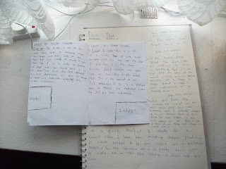
So after a chat with my tutor about the previous design i did he had directed me into a more creative outlet which i took into consideration and created this 2nd mock up. Now with this one from the 1st image where it is just a square each image shows different folded out sections and i have labelled on the sheet on which direction to unfold so there is no confusion and it is easier for readers to access. Now for this idea i liked it a lot better than the booklet i find it more visually creative and appealing to look at. so the idea is snap shot sections of my tutorial videos and put them into some form of comic book strip and then write underneath basically how to do the beat. I find showing the movement of the mouth and having multiple images makes it a lot clearer to explain where as before it was just a big bunch of text that would not off made sense at all to the readers reading this insert. Now after speaking to another tutor he said why not make it a bit more creative and have the images slanted onto each other have it a bit messy not to perfectly structured little things like that to make the insert look more applying. Now instead of having a DVD feature i am not having the tutorials uploaded to youtube where in this modern youtube is a prime example of 15 minuites of fame basically because it is what people now use to upload basically anything and even 1 view gives that couple of seconds or minuites or how ever the video lasts some form of fame as another person is viewing something you created. Also with idea as well i will host a competition which will be for people on the course and basically the idea for this is to watch my tutorials practice what i demonstrated and then upload there own video the duration can be as long as it wants but on the video it has to have them doing a beatbox freestyle with the beats that i have demonstrated on my tutorial and the winner of this will have a prize from me. Final thing on this will be a guide on how to enter the competition and how to upload videos onto youtube and then send me the url for me to watch and then pick out my favourite.


So here is the first mock up i made of a booklet format and me personally i don't like the out come of it, because thinking of it at a readers point of view i think there is too much text on it for what it should be which is a small demonstration of simple beatboxing sounds. I also think that the layout off each page is a bit all over the place and that there is no proper structure or thought towards this initial idea. just basically slamming images and text on without acknowledging the point of the brief which is to make something that would apply to readers that purchase a copy of wallpaper. BACK TO THE DRAWING BOARD
Here is some quick layout ideas that i had thought for my final piece. My first initial idea was to make some form of booklet showing basic beatboxing tutorials that i personally would demonstrate for people to learn and then to put them on a dvd to have a dvd attachment with the booklet.
This is a page on why i beatbox and what got me into beatboxing so because the image isn't very well taken and you can't read the text i will copy and paste that just underneath here for people to read. i couldn't zoom in onto it as i wouldn't off been able to fit the whole page on so i will have to do it like this.
Why do i beatbox?

I have always been able to make unusual noises using my mouth, cheeks and throat but back then I never knew of beatboxing or what it was. So in 2004 I saw my very first beatboxing video and it was a beatboxer from Tampa in the US, When I first discovered beatboxing I could not believe the things I was hearing and how fast this person was doing the beats within rhythm. I mean I could do these noises but I could never make a continuous loop of noises to sync into rhythm. I didn’t take up beatboxing just from that though but I was more interested on seeing other people perform it and see other styles and techniques that people have done that create them their own profile of style towards beatboxing. I missed a big opportunity in my life we had a beatboxer come into my secondary school and he was known as petebox and he had a workshop for people to learn beatboxing and then perform the things he teaches on a life stage for the district of Bolsover I never took part in it but I regret that I never had done. I started beatboxing personally in about November of 2010, I watched a few tutorials on the basics and then just started creating my own style using different noises and sounds to create a beat and I also improved my rhythm and tempo. Beatboxing also has improved breathing technique as breathing is a key element in beatboxing. I say this because e.g if you’re going at a fast tempo you need to be able to breath in the gaps of the beats just so you can maintain the constant flow of rhythm if not then you will gasp for air and lose rhythm and flow.  So after a few practices I made my very first youtube video for people to watch and let me know what they think. At the time I was very nervous on showing people this little skill I did my original idea was to see the feedback I got and if it was negative I was going to stop doing it. Luckily people was shocked and didn’t expect what I could do and I got good positive comments and people asking me to do more and do more videos etc. So as time goes by I started getting better and making the sounds a lot cleaner and also corpora ting sub genres of music such as drum n bass and dubstep into my style of beatboxing a created for myself. Later on I started communicate with beatboxers all over the world using forums such as the humanbeatbox forum also known as HHBforum and then there was Ventrilo which is an online chat room for people. Meeting all these new people motivated me and pushed me more to improve on things and the community it’s self is very friendly and people just motivate each other and just give you tips on things to work on. In the time I have been on this forum and known these people no one has ever said a bad word about one another. People these days like to call HHB as a big Human Beatboxing Family. Being known in that sort of community gives you a fantastic feeling knowing you are being recognised and earning respect from others for what you do just pushes you to achieve new and greater things. Beatboxing for me is a form of expressing your emotions to others around you and is also just another form of language you learn that really only other beatboxers can relate to. My main influence in beatboxing is everybody that beatboxers each individual beatboxer has their own special thing about them that makes them unique to others whether it be there style there attitude towards others or there techniques.    
I <3 BEATBOX
I then looked into some beatboxers that are well known and shown information on things they have achieved through beatboxing and also picked out beatboxers that have been a massive influence to me to make me get into it all and be more confident and speak to new people etc.
As i have chosen to do beatboxing i went onto the human beatbox forum that i am apart of to find out about some history of beatboxing. I analysed piece of work underlining what i thought was the most important pieces of info towards beatboxing.
So here is my action plan and proposal on what my idea is and what i am going to do to intend on reaching the demands of the brief.
So this is my mind map the first thing i did to show a wide range of thoughts and ideas that i could come up with to produce for the insert for this wall paper magazine. I had thought of many ideas that was possible but i could only choose one and i decided to choose Beatboxing.

15 MINUTES OF FAME PROJECT NORTON COLLEGE FND GRAPHIC DESIGN

This is the brief to the 15 minutes of fame project.
The idea of this project is to create an insert that would go into a wallpaper magazine so it could be a small booklet or a sheet of paper with some form of stylish fold out or even a pop up image. You may choose any topic you like if you are able to show why it can be classed as 15 minutes of fame.