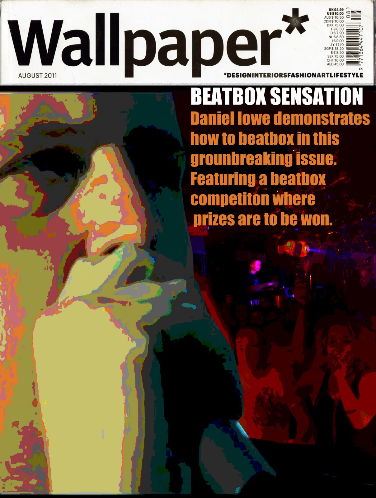
So this is the final outcome of the front cover i am going to use i took a sample of the orange colour on the picture of me and used it on the text. I decided to use the title of the White reasons for that was basically it would be eye catching to people for them to notice and then be interested. As for the orange coloured text i really liked this i thought it fitted in well with the image and it was clear and readable from distance so for e.g someone walks past a shop window they see wallpaper advertised they can read what it says on the cover then they may think HMMM interesting may have to buy that. I originally scanned in one of the hand made edition that i borrowed of my tutor and then inserted my own images over it to promote my insert that i will be making which will be hand made using a sheet of a3 paper and using the layout idea that i spoke about earlier on.

No comments:
Post a Comment