Wednesday, 7 December 2011
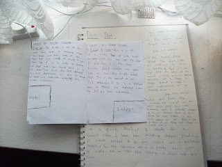
So here is the first mock up i made of a booklet format and me personally i don't like the out come of it, because thinking of it at a readers point of view i think there is too much text on it for what it should be which is a small demonstration of simple beatboxing sounds. I also think that the layout off each page is a bit all over the place and that there is no proper structure or thought towards this initial idea. just basically slamming images and text on without acknowledging the point of the brief which is to make something that would apply to readers that purchase a copy of wallpaper. BACK TO THE DRAWING BOARD
Subscribe to:
Post Comments (Atom)


No comments:
Post a Comment